This website uses cookies and other technologies to enable and support certain functionalities, and to improve user experience.
These cookies are stored in your browser, on your computer.
Your explicit consent is required before storing such cookies.
You are free to reject all cookies.
However, in that case some functionalities may be limited or not available.
You may change your preferences at any time under
Cookie Preferences.
Visualization Documentation
This page provides documentation on the different parts of the visualization, what they show, and how they can be interacted with.
The first part of the documentation explains common terminology and principles from information visualization and interaction design that are used in the visualization, which is helpful for understanding the descriptions.
Then, the individual views and their respective functionalities are explained.
These explanations can also be accessed individually from within the visualization by clicking on the
question mark icon in the upper right corner of each view.
The explanations provided in the present documentation as well as in the info texts in the visualization, use terminology and concepts from information visualization.
We strove to make these texts as accessible as possible to a wider audience, but some basic understanding of the concepts used is still required.
Here, we introduce the terms we used, and explain the visualization types.
Interactive Visualization
Card et al. formalized the so-called data visualization pipeline in 1998 (see here for reference).
This pipeline specifies the steps that data goes through, from its source representation to the point where it is presented to the users using the visualization.
The pipeline consists of four steps, in which certain operations are applied, transforming the data for the next step.
After the last step, the data is present as pixels on a screen (or as ink on paper).
The pipeline allows for viewers to interact with and influence the process during each of the four steps, changing the end result in different ways.
In a first step, the data has been processed into a consistent, clean form, which is stored in the database.
In general, user interaction only applies to the last three steps, and we will focus on these in what follows.
In a second step, through data transformations, the source data is transformed into data tables (i.e., suitably structured data).
These transformations can include general data mapping, aggregation (such as counting or averaging), and filtering (e.g., include data after the year 1000 CE only).
By applying filters in the visualization or changing, for example, the display mode in the settings (cf. here), viewers influence this second step of data transformation.
In the third step, called the visual mapping, the data tables are mapped to visual structures.
For example, in a bar chart visualization, data items are mapped to rectangles, and the value is mapped to the height of the respective rectangle.
In general, data attributes are mapped to visual variables.
Visual variables include, but are not limited to:
position, length (height, width, diameter), area, shape, color value, color hue, or texture.
Examples for interaction with regard to the visual mappings are to switch between qualitative and quantitative mode for the timeline (cf. here).
In this case, data is either mapped to rectangles of different colors, or to stacked area.
Note: In this example, the data transformation step is also affected.
In the fourth and last step, the visual structures are then rendered to the views.
In this step, the view transformations, the visual perspective on the data is also modified.
This is done via geometric transformations: translation, scaling, and rotation (although the latter is used less frequently).
Viewer interaction concerning this step includes, for example, zooming and panning (cf. here).
Zooming and Panning
Zooming and panning are two types of interaction taking place in the image space of the visualization.
However, they possibly interact with other parts of the information visualization pipeline, rather than just with the view transformation step.
Zooming
Zooming is the process of increasing or decreasing the scale of the visualized image.
In a map, this means showing a smaller area of the map in more detail (zooming in), or showing a larger area in less detail (zooming out).
In a timeline, this could mean showing a shorter time span in more detail, or a longer time span in less detail.
In most cases in information visualization, zooming is not merely a geometrical scaling operation (such as zooming in on a picture, simply enlarging the size in which pixels are shown).
Rather, zooming in means that data can be displayed with more detail and less aggregated.
Similarly, when zooming out, data needs to be aggregated more.
Hence, zooming often involves not only the view transformation step, but also the data transformation and visual mapping steps as parts in the information visualization pipeline.
This type of zooming is also called semantic zooming,
as opposed to geometric zooming, which only affects the view transformation step.
Panning
Panning is the process of changing the geometrical translation of the visualized image.
Panning does not affect visual mapping, but only view transformation.
Examples for panning include:
Moving a map's center around, such that an area to the east is now shown.
In maps, panning is often possible by clicking, then dragging the mouse, then releasing.
In this case, there is no zooming involved.
Moving the visible area in a timeline.
For example, the timeline first shows the time span from 600 CE to 800 CE.
After panning, the time span shown covers the years 650 CE to 850 CE;
the timeline was panned by 50 years.
Multiple Coordinated Views
Screenshot of the visualization, consisting of multiple coordinated views.
Each view visualizes one aspect of the data, and interactions with one view are reflected in the others.
A multiple coordinated views (MCV) visualization consists, as the name implies, of multiple views.
These views are visually separated, either just by empty space between them or by borders.
In Damast (see this screenshot), each view is displayed in a separate user interface (UI) element.
These UI elements are called panes and can be resized, rearranged, or maximized, similar to the way windows can be interacted with in an operating system such as Microsoft Windows.
In an MCV visualization, each view shows a different perspective on the same data;
that is, the view visualizes a specific aspect of the data.
In Damast, one view visualizes the temporal aspect of the data (the timeline), another view the geospatial aspect (the map), and so on.
However, the same underlying data (pieces of evidence) is shown in each view.
Further, the views are coordinated, meaning that interaction with one of the views is reflected by changes in other views.
This screenshot provides an example:
Filtering by time range in the timeline view also affects the data shown in the map view.
After filtering, only places with evidence from that time range are shown.
For more details on the different interactions; see the sections on
filtering,
selection, and
brushing and linking.
Filtering
Damast is a top-down visualization, meaning that initially, all data is shown, and users can then drill down into that data to find smaller, more specific subsets of the data.
The drill-down is realized by applying filters to the data.
A filter decides for each datum whether it matches specific criteria or not.
Applying a filter to a dataset results in a subset of the dataset (not necessarily a proper subset in mathematical terms).
An example for a filter in Damast is to select a time span from the timeline.
The filter then specifies the time span within which the evidence must lie to still be visualized.
Another example is to specify one or more sources that the evidence must be attributed to;
in this case, the data visualized stems from these sources only.
Our MCV visualization (see above) implements multi-faceted filtering.
That means that each view can have a separate filter active at the same time.
Because the views show different aspects of the same data, the filters, too, apply to different aspects of the data:
The timeline filter applies to the temporal aspect of the evidence, the map filter applies to the geospatial aspect of the evidence, and so on.
Generally, one should be aware of how these filters work between as opposed to within views.
Between views, the filters are applied in conjuction;
that is, a piece of evidence is shown only if it matches all filters.
For example, if the map and timeline both have an active filter, evidence is only visualized if it is within the specified time span and within the specified geographical region.
Within views, the filters are applied in disjunction; that is, a piece of evidence matches the filter if it matches any of the criteria.
For example, if a religion filter with two religions is active, it matches evidence that has either one or the other religion.
This behavior is logical, in that there can be no evidence that has both religions at the same time, or is attributed to two places at once.
Selection
Selection is a user interaction with the data.
In Damast, selection is done by clicking on some visual element with the computer mouse.
For example, clicking a glyph (i.e., a symbol representing one or more places) in the map informs the visualization that the user selected that glyph.
Note that what the visualization does in reaction to clicking is no longer part of the selection itself.
For the main purpose of selection, see brushing and linking below.
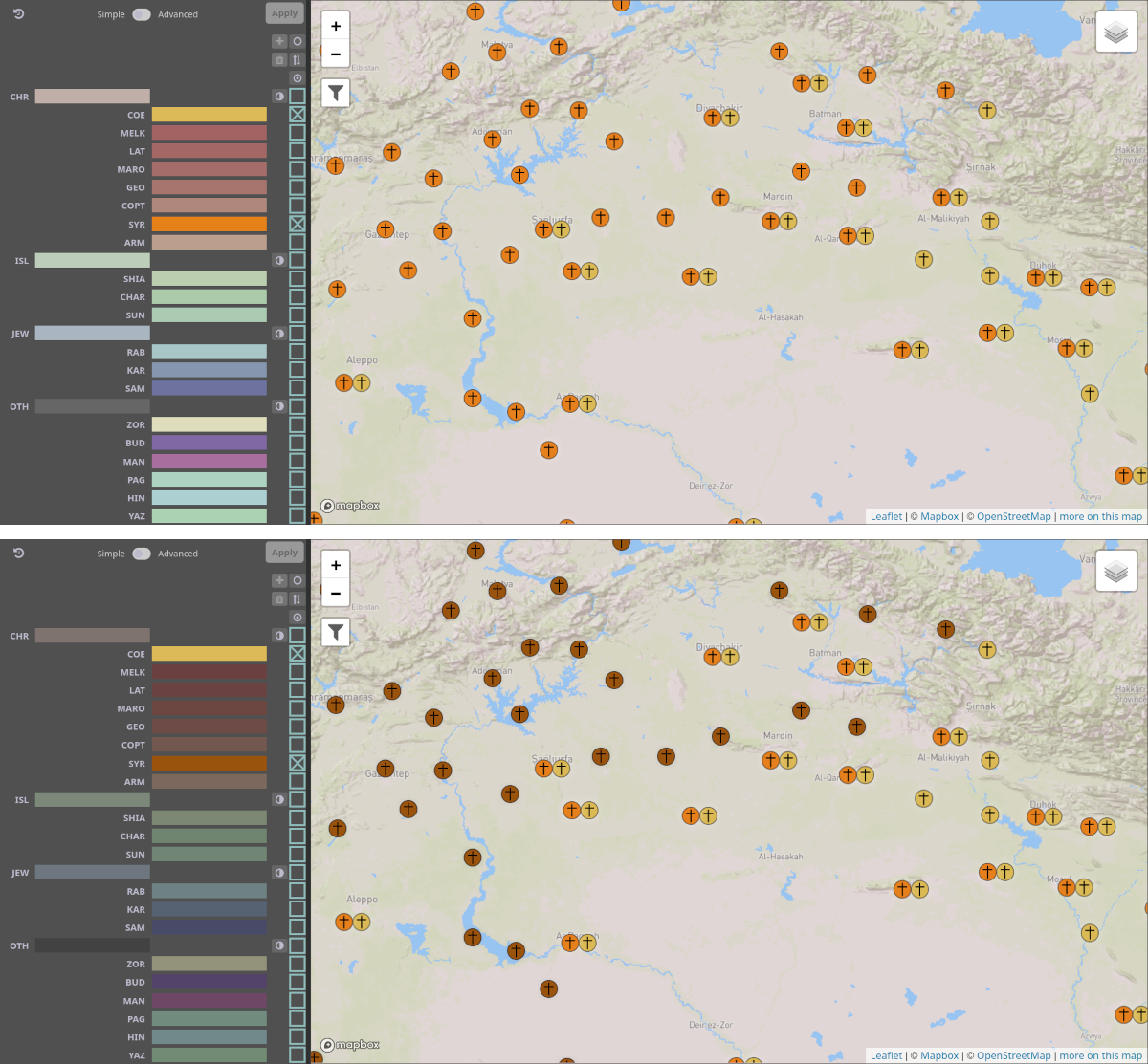
Brushing and Linking
Example for brushing and linking.
Evidence of two religious groups is visualized (top).
After selecting the Church of the East (COE) in the religion view, evidence of COE is brushed, and the respective visual representations of that data are linked in all views (bottom).
In the religion view, all other religions' representations are desaturated and darkened.
In the map, all map glyphs for places or clusters of places not containing COE evidence are darkened and desaturated.
Brushing and linking is a process used in interactive MCV visualizations to help users understand the connection between different views, or rather, between different aspects of the visualized data.
First, the user selects some visual element in the visualization.
The visualization interprets that selection, and performs brushing on the underlying data that is represented by that element.
Next, the visualization links the brushed data in all views by applying specific highlighting to them.
In Damast, brushing always happens on a subset of the visualized evidence.
The linking is then done in all views, including the one the selection and brushing originated from.
In most views, we display linked elements by keeping their saturation, while all elements that are not linked are desaturated and darkened.
A notable exception to this behavior is the timeline, where linking will show the temporal data from the brushed subset only, while all other data will be hidden.
Clicking on the same selected element again will revert the selection and also clear the brushing and linking.
Selecting any other visual element will instead replace the selection and brushing and linking will apply to the new subset accordingly.
In the map, the brushing and linking can also be cleared by clicking in an empty place.
A source of confusion with the term brushing can be that it is interpreted in the sense of paint brush;
in that sense, the brushing itself would be a change of the visual representation of the elements (e.g., their being highlighted).
However, this change of the visual representation is the linking part.
Rather, brushing should be understood as in touching (or brushing) with one's fingers:
Selecting a subset of data touches (brushes) them, and the subset of data is highlighted in all views, thereby visually linking the data to the selection and providing context.
This screenshot shows an example of brushing and linking in Damast:
Evidence from two religions is visualized.
Clicking on one of these religions in the religion view selects it and brushes the respective evidence.
The visual representations of this subset of evidence is then linked in all views by desaturating the elements that are not part of the subset.
Visualization Types
A number of visualization types are used in Damast.
The proper scientific terms are used in the description below, and are introduced here.
Bar Chart and Stacked Bar Chart
In a bar chart, categories are represented by rectangular bars, usually with a common baseline in one dimension, and a common width.
The height of each bar encodes a value associated with the respective category.
Bar charts can be horizontal as well, in which case the height of the bars is constant, and the width encodes value instead.
In Damast, the bar charts used are horizontal, for example in the source view.
A special case of bar charts are stacked bar charts, in which each category, or bar, is further divided.
Each segment of the bar encodes a sub-category's value.
In Damast, stacked bar charts are used in the untimed data view, where each general religious affiliation is represented by a bar, and its specific religious groups by segments of that bar.
In all data mode, all regular bar charts turn into stacked bar charts, with one segment for active data, and one for filtered-out data.
Similarly, in confidence mode, a segment for each represented level of confidence is shown.
An even more special case is the normalized stacked bar chart, where the width (or height) of the bars is constant across bars as well.
Hence, the width of individual segments encodes their relative proportion within the parent category.
Normalized stacked bar charts appear in the source view, where they show the distribution of religious groups (or confidence levels) within each source.
Stacked Histogram
A histogram shows aggregated values of one value in dependence of another value, usually time, which is split up into bins.
It is similar to a line chart, but the area between the line and the x-axis is filled in.
A stacked histogram, similar to a stacked bar chart, is a chart where multiple such areas are stacked on top of each other for each bin.
This representation makes it harder to read individual values, but provides a better understanding of the sum over all categories and general trends.
In Damast, stacked histograms are used in the quantitative mode of the timeline view.
Indented Tree
An indented tree is a visualization for hierarchies.
Nodes of the hierarchy are represented as elements placed in individual rows, or columns.
To signify parent-child relationships, children are indented further than their parents.
Indented trees are often used in file managers to show directory structures, or in mail programs to display e-mail threads.
In Damast, an indented tree visualization is used to show the hierarchy of religious groups.
Settings Pane
The settings pane.
Some commonly-used functionalities from the settings pane are also offered in the header of the visualization.
This pane shows different settings pertaining to the visualization.
It also offers some functionalities to store or load these settings and to generate reports from the currently shown data.
A few often-used settings and functionalities are also offered separately in the header of the visualization.
Visualization Settings
These are settings that directly affect the visualization.
In particular, they control which data is shown and in which way.
Show filtered data
This switch controls if data is visualized although it does not match the currently applied filters.
If All data is selected, non-matched data is shown in less saturated colors.
Otherwise, it is not shown at all.
Display mode
This switch controls which aspect of the data is mapped to color.
If Religion is selected, religion is used for coloring, using the color scheme in the religion view..
If Confidence is selected, the level of confidence is used, using the color scheme in the confidence view.
The aspect of confidence used for the visualization can be selected in the confidence view;
there, the currently used aspect is indicated with an eye symbol below the column.
Timeline mode
This switch controls whether the timeline shows a qualitative summary or quantitative information.
If Quantitative is selected, the number of pieces of evidence of that type in that year is represented by the height of the area.
The timeline then looks like a stacked histogram.
If Qualitative is selected, the timeline only shows whether there are pieces of evidence of that type each year.
Map mode
This switch controls whether map glyphs are clustered or unclustered.
By default, glyphs are clustered:
zooming out will lead to religions attributed to different places being clustered (summarized).
(Note that for these clusters, all places are treated equally;
for example, the distribution of religions of place A and place B is combined without taking into account any further aspects of A or B.)
If glyphs are unclustered, one small symbol per place and religion is shown.
Note: This mode may lead to overlap of symbols when zooming out even to a relative small scale and should, thus, be used with due caution when interpreting the results.
Generate Report
With this feature, a detailed text report can be generated, which presents all data matched by the currently applied filters.
The report will also contain information on the filter criteria that led to the selection of data.
After clicking Generate report, a new tab in the browser will open.
A report can also be created by uploading a visualization state that was saved and downloaded beforehand (see below).
More about reports can be found on the start page.
Note: It is not advised to create a report with very broad filter criteria, as it will become very long and thus difficult to handle.
This section also has a button labeled Describe filters.
Clicking this button will open a small window (a so-called modal window) that describes the currently active filters in text form.
This description is the same as the one at the top of a report.
Layout Settings
The current layout of the visualization; i.e., the arrangement of the views, can be saved.
This feature is only available if the essential cookies is accepted in the Cookie preferences (accessible through the menu bar on top).
The layout settings will only persist for the currently used browser and computer (using localStorage).
You can also reset the layout to the initial state. Note that this will reload the page.
Note: Depending on your browser settings, cookies may be deleted after closing the browser, which leads to the loss of the saved layout settings.
Persist State
With this feature, the current overall state of the visualization can be saved.
In particular, this will save
the filters that are currently applied,
the center point, zoom level, and visible layers of the map, and
These settings are downloaded as a file to the computer.
Later, such a file can be uploaded to restore the state.
The file can also be shared to either present your results or to (re-)generate a report based on the filters.
Download GeoJSON
You can download a GeoJSON file with the currently-visible places (i.e., places with pieces of evidence that match the current filters).
In the settings pane, there are two buttons to download variants with fewer or more details.
The first variant only contains the places and their names.
The second variant also contains some additional information about the places (alternative names, external URIs), as well as evidence data (religious groups, time spans, confidence values, etc.).
The first variant can also be accessed directly from the header shortcuts.
For places with no position, the geometry attribute is set to null, as suggested in section 3.2 of RFC 7946.
The location confidence of these places is also null.
Map
The map pane in clusteredmap mode.
The map visualizes the geographical aspect of the data, i.e., evidence for the presence of religious groups at different locations.
Content
Map Glyphs
Pieces of evidence are represented by so-called map glyphs.
By default, these map glyphs are clustered (i.e., aggregated, or summarized).
This aggregation depends on the data currently active and on the current zoom level of the map;
that is, once the zoom level or filters are changed, the map is populated with glyphs according to the aggregation rules;
simply panning the map will not affect the map glyphs.
More details are given below.
This map mode is called clustered.
It can be changed in the settings (cf. the info text below and the info text of the Settings pane).
Aggregation of Locations
Locations are aggregated to eliminate overlap, and so, by default, each map glyph represents one or more cities, depending on the zoom level.
Note: For this aggregation, all places are treated equally;
that is, the distribution of religions of place A and place B is combined without taking into account any further aspects of A or B.
When hovering over a glyph, it loses opacity and the aggregated locations are indicated on the map as small turquoise dots (maybe partially covered by the glyph).
While hovering, a tooltip is also shown, which provides information on the number of pieces of evidence, of religions, and of places related to the glyph.
As long as the glyph does not aggregate more than five places, the toponym, geographical coordinates, and more information on the pieces of evidence belonging to that place are provided for each place.
Even more details are provided if the glyph only represents one place.
Aggregation of Religions
A map glyph consists of up to four circles, each representing a general religious affiliation with a distinct symbol and color:
Christianity: cross, red/orange
Islam: crescent, green
Judaism: Star of David, blue
Other: dot, varying colors
Generally, multiple religious groups belonging to the same general religious affiliation are aggregated to one circle.
This circle then functions like a pie chart:
in religion mode (set by default), each piece of the pie chart represents a different religious group in its respective color and the piece's size shows the amount of pieces of evidence of that religious group relative to the overall evidence of its general religious affiliation.
In confidence mode, the division of the circle or pie chart is based on the pieces of evidence attributed with different levels of confidence and is colored accordingly.
However, if, regarding all map glyphs currently displayed, no more than four religous groups are to be represented, there can be more than one circle representing a general religious affiliation.
For instance, if only COE (Church of the East), SYR (Syriac Orthodox Church), and SUN (Sunni Islam) are filtered using the religion view, any given map glyph cannot have more than three circles.
Accordingly, both COE and SYR will be represented by an individual circle with a cross and the respective color.
Note that this aggregation may result from other filters or interactions with the map, not just filtering using the religion view, as the map glyphs are dynamically altered based on many different criteria.
Note that placement and aggregation of map glyphs depends on the data currently active as well as the zoom level—not, however, on the current center of the map.
In other words, all map glyphs currently displayed include map glyphs outside the current scope of the map that will appear when panning the map.
If in at least one glyph currently displayed multiple religious groups are aggregated into one circle, this same aggregation will apply to all other glyphs as well, even if, in sum, they have less than four circles and would not be aggregated.
Otherwise, the perceived variety and distribution of religions would be skewed;
for example, a location with only two Christian groups would be represented by a map glyph with two circles for Christianity, while a location with many Christian groups as well as other groups would be displayed with only one such circle.
In only active mode, data that has been filtered out disappears from the map.
Note that this can lead to glyphs having less circles, if, for example, all Christian data of a glyph has been filtered out.
In all data mode, data that has been filtered out is indicated by less saturated colors.
Unclustered Mode
The map pane in unclusteredmap mode.
The aggregation or clustering of places can be turned off in the settings pane.
In this map mode, called unclustered, each location is represented by an individual glyph.
Here, the glyphs consist of smaller circles, one for each religious group.
These circles are arranged in a hexagonal pattern.
Overlap can and will happen in this mode, even when zooming out to a relative small scale.
Z-ordering of the glyphs ensures that glyphs with fewer religious groups appear in front of larger glyphs with more religious groups.
Note: For both modes, the specific way of representing the data should be considered when interpreting the results.
Layers
The map provides multiple layers, which can be controlled from the layer control in the upper right corner.
One of two base layers is always selected and shown:
by default, a layer based on a custom map from MapBox is selected, which shows topological features but no geo-political borders (i.e., borders of modern nation states).
As an alternative, a map provided by the Digital Atlas of the Roman Empire (DARE) can be selected as the base layer.
In addition, one or more overlay layers can be shown:
Markers
consists of the clustered or unclustered map glyphs. It is shown by default.
Diversity Markers
displays all locations, without clustering, each colored according to its religious diversity (i.e., the number of distinct religions present in each place). The color scale Viridis is used, where low values are mapped to violet, and high values to yellow.
Diversity Distribution
shows an estimation of the religious diversity and is colored according to the same scale as the diversity markers.
Distribution
shows an estimation of the density of pieces of evidence.
Note: The two layers for diversity (one displaying markers, the other displaying a heatmap) are alternative representations of the same data.
Thus, they should not be both displayed at the same time.
Similarly, the two layers using markers (the default one displaying map glyphs and the one displaying markers of diversity) should not be shown together.
What the Map is not Showing
Damast visualizes religious constellations in cities and towns of the Islamicate world with static Non-Muslim communities.
The map does not depict a representation of the population density in the medieval Middle East.
In other words, an area with no or only few map glyphs is not necesarrily less populated than other areas.
The map makes no claim to be complete, nor does it show the general distribution of religions in a given area.
Empty areas on the map can have multiple reasons:
The area is outside the geographical scope of Damast, e.g., Europe.
No data for a city was collected.
No data on non-Muslim communities was available.
Furthermore, in clustered mode, the overall size of the map glyphs (i.e., the number of circles) does not directly correlate with the number of religions or pieces of evidence;
for instance, a map glyph with three circles does not necessarily represent more pieces of evidence than one with only two circles.
Interaction
The map can be interactively zoomed and panned (i.e., the center of the map is moved).
Selection
Clicking on a map glyph will select the represented places, brush the represented data, and link the respective data in the rest of the views.
Likewise, brushing data in other views will link the respective places in the map.
Also, selecting a place in the location list will pan the map to center on that place.
Map glyphs that are not linked will be displayed in less saturated colors.
Linking persists when zooming, even if clustered glyphs split up or merge.
Note, however, that a map glyph often represents more than one location.
In this case, all of the circles belonging to the glyph are highlighted, even if the linking only refers to part of the evidence.
For instance, a place from the location list, which only has pieces of evidence of the general religious affiliation Christian, may be selected.
If this place is aggregated with other places that additionally have, for instance, Islamic pieces of evidence, both the circle with the crescent as well as the one with the cross are highlighted.
Link to Place URI Page
When hovering over a map glyph, more information is shown in a tooltip (cf. here).
Normal selection (cf. above) will link the places represented by the glyph in the location list view.
From there, the place URI page of each place can be opened for more information.
It is also possible to go to the place URI pages directly from the map:
Holding the shift key down and left-clicking a glyph will directly open the place's URI page if the glyph represents only one place.
If it represents more than one place, a dialog window opens on top of the visualization with a list of the place names.
Each of the names functions as a link to the respective place URI page.
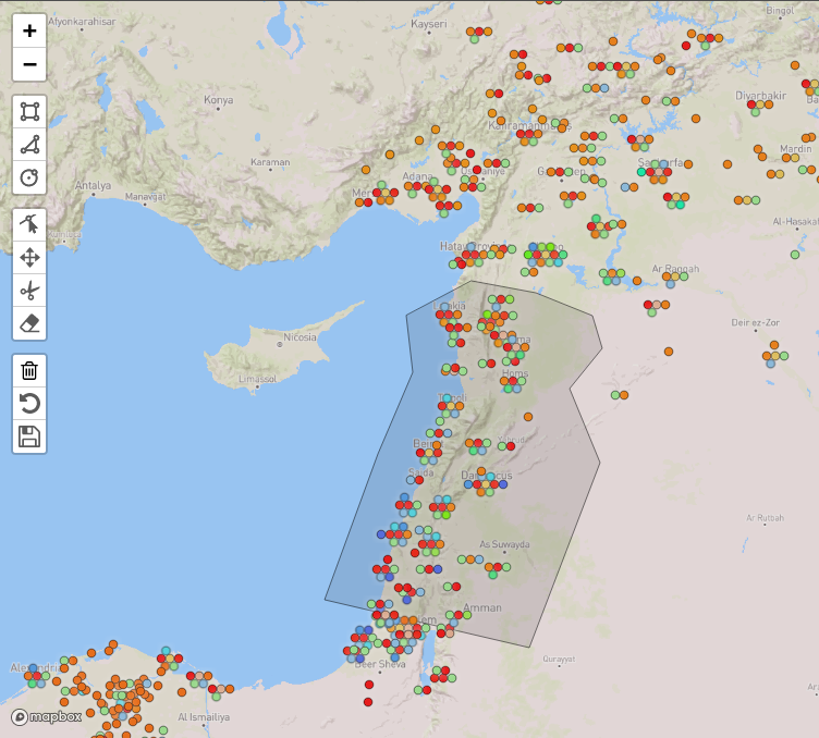
Geographical Filtering
The map pane with the Geoman editor open, and a polygon being edited.
Evidence can be filtered by geographical location.
This is done by drawing the respective bounding shapes into the map.
For this, the Leaflet plugin for Geoman is used.
The respective tools to control the filters are available by clicking on the button with the funnel in the upper left corner of the map, below the zoom buttons.
The button then expands to a set of controls, arranged in three blocks:
the first block for adding elements, the second for editing them, and the third to apply, remove or revert the filters.
These are described in detail below.
Tooltips are shown when hovering over the individual buttons.
The first block is for adding new elements to the bounds.
A rectangular area can be added, by first clicking in the map to select one corner, then moving the mouse, and clicking again to select the opposite corner.
The second option is to add a polygon.
Here, a new point is appended to the polygon each time you click in the map.
To complete the polygon, click on the first node.
The last option is to add a circle.
Click once to select the center, move the mouse, then click again once the circle has the appropriate radius.
Note that the circle is converted to a GeoJSON polygon when saving.
The second block contains controls for editing existing elements.
It is possible to
move points on existing shapes,
move entire shapes,
cut (subtract) a polygon from an existing shape, and
remove entire shapes.
Note that polygons can only be moved or removed individually before they have been applied as filters.
The last block contains controls to apply the created bounds to the dataset filter.
The trash can button removes all existing shapes.
The undo button reverts the bounds back to the state of the currently active filter, i.e., the geographical filters applied last. It then collapses the menu.
The save button applies the new bounds to the dataset filter, and then closes the editor.
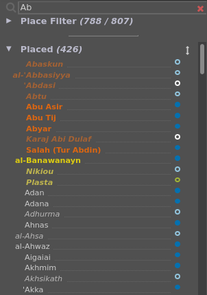
Location List
The location list.
The confidence of location is indicated by a colored marker behind the place name.
Places that match the search term at the top are highlighted in orange if their primary name matches, or in yellow if an alternative name matches.
Names are shown in italics, darker, and desaturated if their level regarding confidence of location is not currently checked.
In this view, all locations in the data are listed, using their main toponym as place name.
Places can be searched, selected and filtered.
Contents
The view consists of several sections:
a search field;
a place filter; and
the actual location list, consisting of two lists, Placed and Unplaced, representing locations with and without geo-coordinates, respectively.
Detailed descriptions how to use the search field and the place filter are found below under Interaction.
In what follows, the two lists are described.
The list Placed contains all locations for which a geographical position is known.
The list Unplaced contains all locations for which a geographical position is not (yet) known;
in this case, the confidence of location is attributed with no value and colored accordingly.
Note: Missing data is normal during research and while entering data is still in progress.
However, missing data can severely affect confidence in the visualization if not properly communicated.
We have therefore chosen to make missing geographical locations and time information explicit in separate views of this interface (apart from the section Unplaced in the location list, cf. the view Untimed Data).
This also allows for searches directed at data in need of improvement.
The position of the two lists can be swapped by clicking on the swap button.
The following is true for both lists:
Each line in the lists represents one location.
Locations are listed using their main toponym as place name.
Accordingly, looking through the lists with a specific place name in mind, if this place name is not the main toponym, the location is not found and should be searched in the Search field.
There, alternative names are considered as well (cf. further below).
The place names are sorted alphabetically, disregarding a prefix of apostrophes (e.g., for the letter ʿain) or Arabic definite articles;
for instance, Amid comes before 'Amman, and Jubayl comes before al-Juma.
In only active mode (cf. the Settings pane), only places with pieces of evidence matching the current filters are listed.
When hovering over the line with the mouse, a tooltip (see this figure) with additional information is shown, that is:
place type,
geographical location (i.e., coordinates),
confidence of location,
alternative names,
external URIs referencing the same place.
Also, while hovering, a link symbol appears at the very end of the line (see this figure).
Clicking the symbol opens an overview for this place, the so-called place URI page (cf. ###).
Note: If the user has rights to edit the database, clicking the symbol leads to the respective entry of the location in the database instead.
Behind the place name, the confidence of location of each place is shown as a small, colored circle.
The color scale is the same as in the confidence view.
In all data mode (cf. the Settings pane), when the filter set for confidence of location does not match the place’s confidence of location, this confidence circle is not filled.
Also, the name is displayed in italics, darker, and in less saturated colors in that case.
A tooltip in the location list, for the place Antioch.
Interaction
Selection
Individual locations can be selected by clicking on the respective line of the list.
This will highlight the location, bring it to the top of the list and show a short vertical line to the left of the place name.
Data related to the selected location will be linked in all other views, while non-selected data will be displayed in less-saturated colors.
Searching for Toponyms
It is possible to search for a specific place using different toponyms in the search field at the top.
Non-Latin scripts can be used for searching, too.
Typing a search query in that field will highlight the search results in bold orange and sort them to the top of the list.
The search matches not only the main toponym but also alternative names;
for example, Edessa will find the respective place under its main toponymal-Ruha.
Matches to alternative names that do not match the main toponym are sorted after main toponym matches and highlighted in bold yellow.
Apart from toponyms, external URIs can be entered in the search field.
For example, syriaca:10 or syriaca.org/place/10 finds Antioch.
The search is partially case-sensitive:
ask finds both Daskara as well as al-Askar Mukram, while Ask only finds al-Askar Mukram.
The search field additionally supports JavaScript-style regular expressions.
For example, searching for Bagh?dad would find Bagdad as well as Baghdad, because h followed by ? matches no h or exactly one h.
For further reference, refer to the documentation here.
Filtering
The expandable section Place Filter at the top of the view allows to filter evidence by place.
When expanded, a list of all places in the database is shown.
If, however, something has been entered into the search field, only places matching the search are listed.
This list is used to include or exclude places from the so-called place set,
that is, the set of places currently active.
For instance, if Baghdad is excluded from the place set, all pieces of evidence attributed to Baghdad are filtered out.
Keep in mind that, when all data mode is active, pieces of evidence attributed to places excluded from the place set are visible but displayed in less saturated colors.
A place can be removed from the place set by clicking on the red minus on its right, or added to the place set by clicking on the green plus.
Note that the selection is not applied until the Apply button is clicked.
This button is disabled if the selected filters are matching the data currently visualized.
A symbol to the left of the place name indicates the current state of the place:
a turquoise check mark if the place is in the currently active place set;
no mark if the place is not in the currently active place set;
a grey cross if it will be excluded from a new place set which has not been applied yet; and
a green check mark if it will be added to a new place set which has not been applied yet.
Place sets can be saved using the Save button under the list.
For users with access to the database, this will store a place set in the database under the name entered by the user.
For users without access to the database, the place set will only be saved to localStorage.
This feature is only available if the option all cookies is accepted in the cookie preferences (accessible through the menu bar on top).
By clicking the Load button, a saved place set can be loaded back into the filter.
Note:: Depending on your browser settings, cookies may be deleted after closing the browser, which leads to the loss of the saved place sets.
Buttons Facilitating Creating Place Sets
Buttons in the top left corner help in editing the place set on a larger scale:
The revert button
will revert the changes to the place set;
that is, the place set will match the current filters.
Note: Because of the functionalities detailed below, the place set will not update from the database when other filters change;
it changes only with the initial load and loads of the visualization state (cf. this feature in the Settings).
Instead, resetting the place set is left to the user, which allows to build up a place set incrementally as illustrated by the example below.
The empty circle button
will uncheck all places;
that is, no place would be included in the intended place set after application.
The exchange button
will invert the current marks;
that is, all places that were marked are unmarked, and vice versa.
The button with dot inside
will check all places;
that is, all places would be included in the intended place set after application.
The
set union button
will extend the place set (PS) by all places currently shown in the location list (LL) (cf. the description above).
That is, all places that were in the place set before are still there, and additionally all places from the location list are checked.
The result is the set union of the previous place set and the current location list:
PSnew = PSold ∪ LL
The
set intersection button
will restrict the place set to contain only a subset of its current contents, namely those places that are also in the location list.
The result is the set intersection of the place set set and the current location list:
PSnew = PSold ∩ LL
The
set subtraction button
will remove all places currently in the location list from the place set.
The result is the set difference of the previous place set and the current location list:
PSnew = PSold ∖ LL
These last three operations can be used to quickly create a complex place set from a number of criteria.
Note: Since they use the contents of the location list, they only make sense when the only active visualization mode is active.
To illustrate the possibilities provided by these operations, consider the following case:
We want to explore all pieces of evidence of Christianity in cities between 800 and 900, where there is evidence for Muslims but not for Jews:
Clear all filters (everything is visible).
Filter by time range (800–900) in the time line.
Filter by religion using the religion view, choosing Islamic groups only, then click Apply.
Restrict the place set to only those places currently displayed by clicking the set intersection button.
The place set now contains all places where there is evidence of Islam between 800 and 900.
Important: Do not yet apply the place set.
This would affect the other views.
Filter by religion using the religion view, choosing Jewish groups only, then click Apply.
Remove the shown places from the place set by clicking the set subtraction button.
The place set now only shows places where there are pieces of evidence of Islam between 800 and 900, but not of Judaism.
Apply the place filter by clicking on the Apply button.
Note: The map is blank;
this is normal as you have just filtered out all places with presence of Judaism while the religion view is still set to show Judaism only.
Filter by religion using the religion view, choosing Christian groups only, then click Apply.
Religion Hierarchy
The religion hierarchy in its default state.
At the top are the controls to revert the filter, the switch between simple and advanced filter mode, and the apply button.
The religions are visualized as an indented tree, and are filtered by enabling the respective checkbox.
This view shows all religious groups contained in the database and allows for selecting and filtering the data according to religion.
Content
The list of religious groups is hierarchical and represented by a tree visualization:
each religious group occupies a line, which is indented according to its rank in the hierarchy.
In technical terms, the higher level is conceptualized as parent, the respective lower levels as children.
Each line consists of an abbreviation for the religious group, a node, displayed as a bar, with the color associated with the group, and a checkbox used for filtering.
Hovering with the mouse over the line displays a tooltip with the full name of the religious group and the number of pieces of evidence for the group based on the currently applied filters.
The general religious affiliation (e.g., Christianity) is on the first level of the hierarchy.
For other religions beside Christianity, Islam, and Judaism, we made the pragmatic choice to group them under the category Other.
The religious groups each have a distinct color.
For Christianity (red), Islam (green), and Judaism (blue), religious groups belonging to these general religious affiliations have hues of the same color.
However, the difference between colors is limited because of the number of religious groups.
In confidence mode (cf. the pane Settings), the bars of the groups are colored based on the average confidence of the represented data.
Details Regarding Coloring and Saturation
Depending on the options show filtered data (all data or only active) as well as display mode (religion or confidence mode) in the settings, the coloring of the bars changes:
Only active,religion mode
A bar has only one color.
If any data related to a religious group is active, the bar has saturated colors;
if all data related to a religious group is filtered out, the bar is shown in a less saturated color.
All data,religion mode
A bar can be divided into two parts, a saturated and a less saturated part.
The less saturated part represents the relative amount of data currently filtered out.
Only active,confidence mode
A bar can be divided into several sections.
Each section represents the relative amount of data with a certain level of confidence.
All data,confidence mode
A bar can be divided into two general parts:
a saturated and a less saturated part, representing the data currently active or filtered out, respectively.
Each part can have several sections, which each represent the relative amount of data with a certain level of confidence.
The aspect of confidence used for the visualization can be selected in the confidence view.
There, the currently used aspect is indicated with an eye symbol below the column.
Interaction
Selection
Clicking on a line will select the religious group.
This group will be highlighted, and other groups will be displayed in less saturated colors.
The data represented by the selection will be brushed, and is linked to related data in all views.
For instance, map glyphs in the map representing pieces of evidence with the selected religion will be highlighted, other locations will be represented by less saturated colors.
Filtering
The checkbox of a religious group can be unchecked, which leads to filtering out this group throughout the entire visualization.
Depending on whether only active or all data mode is selected in the settings, data that has been filtered out is either hidden or displayed in less saturated colors.
There are two basic modes for filtering by religion (more details further below):
In Simple mode, pieces of evidence matching any of the checked religions are shown.
In Advanced mode, only pieces of evidence from places are shown, where checked combinations of religions were present.
Note that, in both modes, the selection is not applied until the Apply button is clicked, which is enabled once there are changes to the filter.
Simple Mode
In simple mode, data is filtered simply according to the checked or unchecked religions.
Initially, all religions are checked.
To filter out a religion, it can be unchecked in the checkbox column.
Advanced Mode
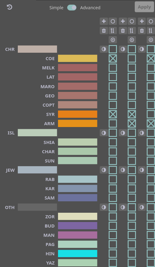
The religion hierarchy in advanced mode.
The filter limits pieces of evidence to those from places where two or more of the Syriac Orthodox Church (SYR), the Armenian Church (ARM), and the Church of the East (COE) are present.
In advanced mode, it is possible to filter not individual religions but different combinations of religions.
For instance, analysis may require to show places where two or more of the following three religious groups exist together: the Syriac Orthodox Church (SYR), the Armenian Church (ARM), and the Church of the East (COE) — but not those places where only one of the three is present.
In this case, pieces of evidence are active if, for any combination, all religions of that combination are present at a place.
Different from simple mode, there are multiple columns of checkboxes.
Each column represents a set of religious groups as described above.
To control the filters in advanced mode, columns can be added by using the plus button above each column.
Every column (except the last remaining one) can be deleted by pressing the delete button above the column.
The following procedure creates a filter corresponding to the analysis described above
(see also this figure):
Switch to advanced mode.
Create two additional columns by pressing the plus button.
In the first column, check SYR and ARM.
In the second column, check SYR and COE.
In the third column, check ARM and COE.
Click the Apply button.
Note: If only places should match the filter where all of these three religious groups are present, only one column in advanced mode is necessary with all three groups checked.
This must be understood as pieces of evidence with COE and ARM and SYR.
In turn, this differs from checking the three religious groups in simple mode, which equals pieces of evidence with COE or ARM or SYR.
Filter Controls
A few additional utilities are available for managing the checkbox columns.
The controls for adding ( plus button) and removing ( delete button) are already described in the advanced mode description.
Importantly, columns can only be added in advanced mode, and the last remaining column cannot be removed.
The additional controls in the view are:
Revert filters
This button is found in the top left corner of the view.
Clicking it reverts the filters back to the state that is currently shown in the visualization;
that is, all changes that are not applied yet are discarded.
Uncheck all boxes in this column
This button is found at the top of each checkbox column.
Clicking it will uncheck all boxes in the column.
Invert all boxes in this column
This button is found at the top of each checkbox column.
Clicking it will invert all boxes in the column;
that is, boxes that were checked are unchecked, and vice versa.
Check all boxes in this column
This button is found at the top of each checkbox column.
Clicking it will check all boxes in the column.
Toggle subtree
This button is present to the left of some of the checkboxes in each column;
namely regarding religions that have children in the hierarchy.
Clicking the button will check or uncheck this religion and all its children in the respective column.
Whether clicking checks or unchecks depends on whether the majority of checkboxes in the subtree are checked.
Timeline
The timeline in qualitative mode, showing three religious groups.
A time range between 830 and 1090 is set as the filter.
The Timeline shows the distribution of the different religious groups along the overall time period: 600–1400 CE.
In confidence mode, the level of confidence is shown instead of religious groups (cf. the info texts of the Confidence view and of the Settings pane, respectively).
Content
The timeline consists of two graphs:
the main timeline and a smaller overview.
The graphs are described in the following.
Also, the view changes depending on the choice of show filtered data in the settings (cf. documentation):
in all data mode, data that has been filtered out is indicated by less saturated colors.
In only active mode, data that has been filtered out is hidden from the visualization in all views, including the timeline.
Main Timeline / Upper Graph
The timeline in qualitative mode.
The main timeline shows either a qualitative summary or quantitative information, depending on the timeline mode selected in the settings pane.
If quantitative is selected, the number of pieces of evidence of that type in that year is encoded into the height of the area as a stacked histogram.
If qualitative is selected, the timeline only shows whether there is evidence of that type each year.
The colors used in the graph match the ones used in the religion view or confidence view, depending on the display mode selected in the settings pane.
Importantly, the main timeline can be used to filter the data according to time (cf. below).
Overview / Lower Graph
The smaller overview serves as a minimap for the larger main timeline:
it always shows the entire time range contained in the database.
By clicking and dragging in the overview, a rectangle can be drawn which represents a time range.
The main timelinezooms to this time range and shows data in greater detail.
The overview represented by the lower graph does not change during this zooming in the upper graph.
Vice versa, if the data is filtered by clicking and dragging in the main timeline (cf. Filteringbelow), the selected range is indicated as a thick bar below the overview.
The rectangle representing the time range for zooming can be moved by clicking and dragging or altered by changing the width of the rectangle.
Note the mouse cursor in form of a grabbing hand (or a four-headed arrow) when hovering over the rectangle or the double-headed arrow when hovering the left and right borders of the rectangle, respectively.
Clicking anywhere in the overview outside the rectangle will deactivate the zooming.
Tooltips
When hovering over any of the graphs, a tooltip with a summary of pieces of evidence for that year is displayed.
If the main timeline shows a smaller time range than the overview, the year in the tooltip depends on whether the mouse cursor is on the main timeline or the overview.
When selecting data in other views, through brushing and linking, only the selected data shows in the timeline.
Note: Selecting data in the timeline itself is not possible.
Interaction
Filtering
By clicking and dragging in the main timeline, a rectangle can be drawn which represents a time range.
Data outside the time range is filtered out;
accordingly, the area outside the rectangle is displayed in less saturated colors.
The time range serves as a time filter for the data across all views.
The rectangle representing the time range for filtering can be moved by clicking and dragging or altered by changing the width of the rectangle.
Note the mouse cursor in form of a grabbing hand when hovering over the rectangle or the double-headed arrow when hovering the left and right borders of the rectangle, respectively.
Clicking anywhere in the main timeline resets the filter.
Untimed Data
Data with missing temporal information cannot be included in the timeline.
Accordingly, this data is visualized in the Untimed Data view as a stacked bar chart.
Content
The chart is divided by the four general religious affiliations along the x-axis.
All pieces of evidence that have no temporal information and belong to one of these religious affiliations are stacked, with the number of pieces of evidence on the y-axis.
The pieces of evidence are grouped and colored according to the religious group or the level of confidence, depending on the display mode selected in the settings pane (cf. the info text there).
Note: Missing data is normal during research and while entering data is still in progress.
However, missing data can severely affect confidence in the visualization if not properly communicated.
We have therefore chosen to make missing geographical locations and time information explicit in separate views of this interface (apart from untimed data, cf. the unplaced data in the location list).
This also allows for searches directed at data in need of improvement.
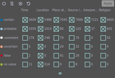
Confidence View
The confidence view.
Aspects of confidence are listed as columns, and confidence levels ordered into rows.
Checkboxes control which confidence levels should be shown for each aspect, and the number of pieces of evidence for each confidence level and aspect are given.
This view shows the different levels of confidence attributed to the different elements of a piece of evidence (i.e., place, religious group, time span, etc.).
Contents
The view consists of a table, in which each row represents one level of confidence and each column an aspect of confidence.
For each cell in the table, a checkbox for filtering (cf. further below) is displayed as well as the number of pieces of evidence with the respective confidence and aspect.
The rows are sorted by descending level of confidence.
Levels of Confidence
Generally, the confidence of any given information was categorized according to these 5 degrees:
certain (blue),
probable,
contested,
uncertain, and
false (red).
In addition, a confidence can have no value at all (green).
Note: The attribution with no value is used while data is still being collected and usually does not appear in a published instance of this visualization.
A notable exception are places, especially regions, with no geographical coordinates.
In that case, no attribution of confidence except no value is suitable.
Aspects of Confidence
Confidence is attributed to different aspects of the data:
Timespan confidence
signifies the confidence in the veracity of the timespan stored in a piece of evidence.
Pieces of evidence without a time attribute are assigned the confidence no value.
Confidence of location
signifies the confidence in the geographical location of a place.
Some places, especially regions, have no value (cf. above).
Confidence of place attribution
signifies the confidence in assigning a location from the database to a toponym from a source.
Confidence regarding the source
signifies the confidence in the veracity and objectivity of the source itself regarding a piece of evidence.
Confidence of interpretation
signifies the confidence in the correct interpretation and recording of the source when entering a piece of evidence into the database.
Confidence regarding religion
signifies the confidence in the veracity of the presence of a particular religious group at a given time and place.
Interaction
Filtering
For each aspect of confidence and each confidence level, a checkbox is shown in the respective cell.
Unchecking a checkbox will filter out pieces of evidence with this confidence level for that aspect of confidence.
This allows for a very fine-grained control over what data to visualize.
Note that the selection is not applied until the Apply button is clicked.
This button is disabled if the selected filters are matching the data currently visualized.
The filters work in logical conjunction across different aspects of confidence;
that is, having filters in place for multiple aspects of confidence will only show pieces of evidence that match all filters.
Four additional buttons in the top left corner make filtering more convenient:
Uncheck all
Uncheck all checkboxes.
Invert
Invert all checkboxes.
Checked boxes are unchecked, unchecked boxes are checked.
Check all
Check all checkboxes.
Default
Revert the selection of checkboxes to the default.
By default, all confidence levels are selected for confidence of location, and only certain and probable for the other confidence aspects.
In addition, entire rows or columns of checkboxes can be set to either checked or unchecked by clicking the row header (the confidence levels) or the column header (the aspects of confidence).
Here, the new value for the new row (or column) is the inverse of what the majority of values (3 or more) was before;
for example, if 4 checkboxes were checked and 2 unchecked for the uncertain row, clicking on the row header would uncheck all checkboxes in the row.
Visualized Aspect of Confidence
By clicking on the eye in the bottom row of each column, the aspect of confidence that is visualized in Confidence mode (cf. Display mode in the settings pane) can be selected.
The currently selected aspect is indicated by a colored eye.
By default, confidence regarding religion is used.
Source View
The source view.
This view shows the sources from which the pieces of evidence (i.e., sets of data concerning a place, religious group, time span, and the respective confidences) were gathered.
Contents
The view consists of a table, in which each row represents one source.
The rows are sorted by descending number of pieces of evidence.
Note that a piece of evidence can stem from more than one source;
therefore, the sum total of all references to sources can be larger than the sum total of pieces of evidence.
In what follows, the respective columns of one given row are described.
Checkboxes
The first column contains a checkbox that toggles the visibility of evidence from a source.
Keep in mind that a piece of evidence can stem from more than one source:
as long as any source associated with a piece of evidence is checked in this view, the piece of evidence will be active.
Short Names
The second column shows the short name of the source, generally an abbreviation.
The full name of the source with bibliographical details is available via a tooltip;
that is, when hovering over the name with the mouse.
Religion/Confidence Segmentation Visualization
The third column visualizes the segmentation of the pieces of evidence on the religions or on the levels of confidence, depending on the chosen display mode (cf. Display mode in the settings pane;
in confidence mode, instead of religion, the currently selected aspect of confidence is used.)
The visualization used is a normalized stacked bar chart.
Because the total width of the bars is the same regardless of the amount of pieces of evidence, the width of each segment signifies the number of pieces of evidence with that religion or confidence level in relation to the total evidence count for that source.
Evidence Count Visualization
The fourth column visualizes the count of pieces of evidence for each source.
This column uses the same scaling in all rows:
the longer the bar, the more pieces of evidence stem from the respective source.
This effectively creates a vertical histogram across the rows.
Interaction
Selection
Clicking on a row will select the source, brush the represented data, and link related data in all views.
For instance, locations in the map with pieces of evidence from the selected source will be highlighted, other locations will be represented by less saturated colors.
Clicking on the same row again will reset the selection.
Selecting a different row, or an element in a different view, will replace the selection;
that is, only one source can be selected at a time.
Filtering
A source can be filtered out from the visualized data in all views by (un-)checking the respective checkbox.
Note that the new filter is not applied until the Apply button is clicked.
This button is disabled if the selected filters are matching the data currently visualized.
Checking multiple (or all) sources works as a logical disjunction:
a piece of evidence is matched if it stems from any of the checked sources.
The source filter works together with filters from other views in logical conjunction;
for instance, if only source X and religion Y are set active in the respective views, only pieces of evidence with source X and religion Y are matched.
Three additional buttons in the top left corner make filtering more convenient:
Uncheck all
Uncheck all checkboxes.
Invert
Invert all checkboxes.
Checked boxes are unchecked, unchecked boxes are checked.
Check all
Check all checkboxes.
Sorting
The order of the shown sources can be changed using the sorting options switch in the center of the header of the view.
The two options are:
Name
Sort the sources first alphabetically, in ascending order, by their short name, which is shown in the second column of the list.
Count
Sort the sources first in descending order by the number of visible pieces of evidence derived from them.
This is the default.
For both sorting modes, the other sorting criterion is considered as secondary criterion.
More specifically, if the sources are ordered by count, and two sources have the same count, the source that would come first alphabetically is listed first of the two.
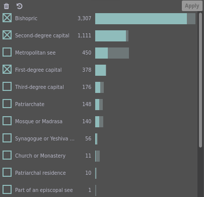
Tag View
The tags view.
Three tags were selected.
This view shows tags which are associated with pieces of evidence (i.e., sets of data concerning a place, religious group, time span, and the respective confidences).
Tags were implemented to include additional information and to make further distinctions possible.
For instance, the tag Bishopric is attributed to pieces of evidence referring to bishoprics as distinguished from metropolitan sees.
This way, the visualized data can be filtered according to additional criteria.
Note that, by default, all tags are selected.
This means that no filters based on tags are active (cf. below).
Contents
The view consists of a table, in which each row represents one tag.
The rows are sorted by default by descending number of pieces of evidence.
In what follows, the respective columns of one given row are described.
Checkboxes
The first column contains a checkbox used for filtering.
Tag Names
The second column shows the name of the tag.
Generally, the name should be self-explanatory.
Further information is displayed when hovering with the mouse.
Evidence Count
The third column shows the active number of pieces of evidence with that tag.
Evidence Count Visualization
The fourth column visualizes the count of pieces of evidence for each source.
The less saturated part of the bar represents pieces of evidence that are not active (i.e., do not match the current filters).
Interaction
Selection
Clicking on a row will select the tag, brush the represented data, and link related data in all views.
For instance, locations in the map with pieces of evidence with the selected tag will be highlighted, other locations will be represented by less saturated colors.
Clicking on the same row again will reset the selection.
Selecting a different row, or an element in a different view, will replace the selection.
Only one tag at a time can be selected.
Filtering
The visualized data can be filtered according to one tag or multiple tags in all views by (un-)checking the appropriate checkbox or checkboxes.
Keep in mind that a piece of evidence can have no tag, one tag, or multiple tags.
If, for instance, it has no tag, its visibility is not affected by the checkboxes.
If, on the other hand, it has multiple tags, its visibility is only affected by (un-)checking all respective checkboxes.
Note that the selection is not applied until the Apply button is clicked.
Checking multiple (or all) tags works as a logical disjunction:
a piece of evidence is matched if it is assigned any of the checked tags.
The tag filter works together with filters from other views in logical conjunction:
for instance, if only tag X and religion Y are selected in the respective views, only pieces of evidence with tag X and religion Y are matched.
Three additional buttons in the top left corner make filtering more convenient:
Uncheck all
Uncheck all checkboxes.
Invert
Invert all checkboxes.
Checked boxes are unchecked, unchecked boxes are checked.
Check all
Check all checkboxes.
Sorting
The order of the shown tags can be changed using the sorting options switch in the center of the header of the view.
The two options are:
Name
Sort the tags alphabetically, in ascending order, by their short name, which is shown in the second column of the list.
Count
Sort the tags first in descending order by the number of visible pieces of evidence derived from them.
This is the default.
For both sorting modes, the other sorting criterion is considered as secondary criterion.
More specifically, if the tags are ordered by count, and two tags have the same count, the tag that would come first alphabetically is listed first of the two.